Have you ever wondered why a certain product
sells more in a given season? Have you thought about how complicated
forecasting sales would be without any indication of when your organization
should produce more or less? What about hotel chains, how do they work around
the optimum occupancy rate?
A Scatter
diagram is one of the Seven Traditional Quality Tools. It
offers business practitioners an easy way to understand what the correlation
between two variables is. But why is it important for you to know that? Imagine
that your efforts in either hiring temp workers, or producing a product, or
selling a course revolves around not only market demand but also around when the demand exists. Now imagine the
amount of defect parts your process produces exactly when you receive shipments
from a certain supplier. Understanding the correlation between two variables
does exactly that: it lets you explore the possible impact of an independent variable on a dependent variable. Let’s work with a simple example: consider
the relationship between water consumption during a marathon in the summer and
the temperature outside. I can certainly state that the hotter it is outside the more water a runner tends to consume.
I believe you’d agree with that. Now let us switch gears. Can I say that the more water a runner consumes the hotter
it is outside? Not really, the temperatures in the summer have nothing to
do with how much water one drinks.
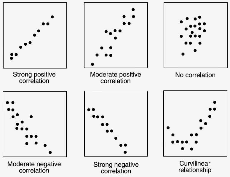
There is also a formula for calculating the
relationship between two variables (called correlation coefficient). Excel can
easily and quickly calculate that for you. (Check link at the bottom of this
post). Furthermore, it is equally important to understand if the two variables
you are studying have a weak or a strong correlationship, or if they have a
correlationship at all. The image placed at the top of this post shows the more
important types of relationships. Put yourself to the challenge: what are the
types of relationships your process may have? As always, eZsigma is here to
help in case you need further education on this and other topics related to the
Seven Quality tools and process improvement.
Thanks for the post! Here are steps on creating a Scatter Plot using ProcessMA software http://www.processma.com/documentation/ScatterPlot.html
ReplyDelete